
In the ever-evolving world of beauty, standing out requires more than just quality products—it demands a compelling visual identity that captures the essence of the brand and resonates with its audience. Today, we’re diving into how five modern makeup brands—Glossier, Rare Beauty, Tower 28, and others—have revolutionized the industry not just with their innovative products but with their distinctive visual identities. These brands have not only carved out unique spaces for themselves but have also set new standards in branding within the beauty industry.
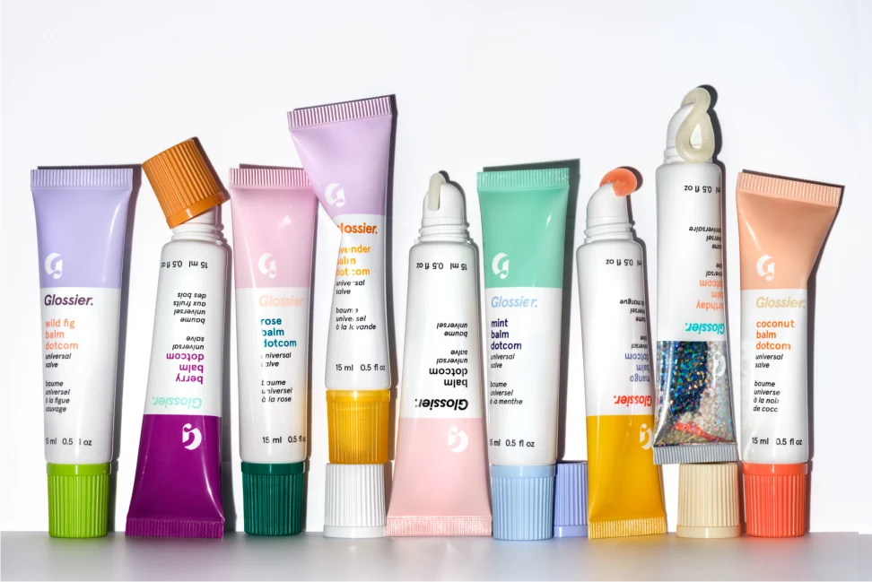
Glossier: The Epitome of Minimalist Chic
Glossier, a brand that started as a beauty blog, has become a cult favorite, thanks largely to its unique visual identity. With its signature pale pink shade, minimalist packaging, and focus on natural beauty, Glossier’s branding speaks to the modern consumer who values simplicity and authenticity. The brand’s visual language, from its website to its Instagram feed, exudes a clean, fresh vibe that’s instantly recognizable—a testament to the power of consistency in color and design.

Rare Beauty: Empowering Beauty in Diversity
Founded by Selena Gomez, Rare Beauty challenges the traditional norms of beauty with its mission of inclusivity. The brand’s visual identity showcases a wide spectrum of beauty through diverse models, vibrant product photography, and a warm, inviting color palette. Rare Beauty’s logo, simple yet bold, reflects the brand’s commitment to making everyone feel beautiful. The messaging and imagery consistently emphasize self-acceptance and the celebration of individuality.
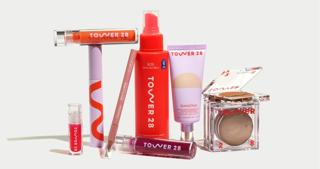
Tower 28: Bringing Fun Back into Beauty
Tower 28 has made waves with its playful and vibrant visual identity that stands out in a sea of minimalism. Inspired by the lifeguard towers of Santa Monica Beach, the brand infuses sunny, California vibes into its packaging and marketing. Bright colors, fun product names, and a focus on clean, vegan beauty make Tower 28 not just a makeup brand but a lifestyle choice for the eco-conscious consumer looking for a pop of joy.
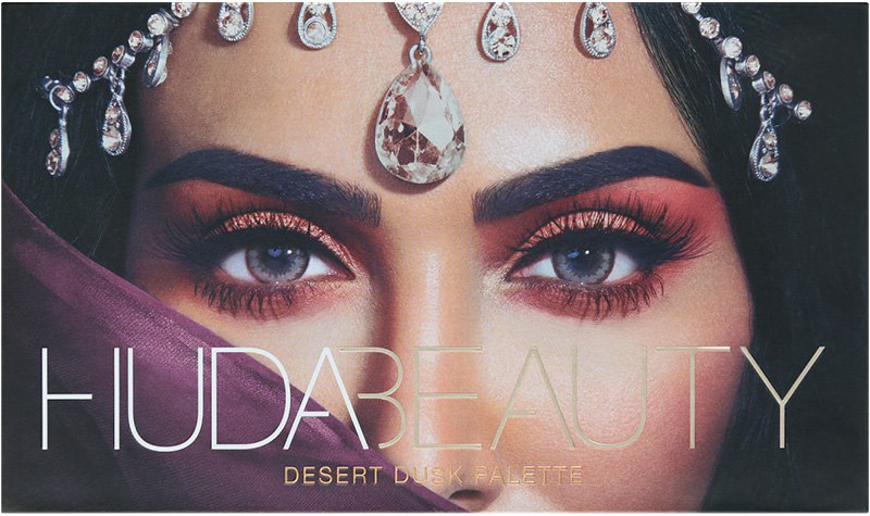
Huda Beauty: Redefining Glamour with a Personal Touch
Huda Beauty, founded by Huda Kattan, has taken the beauty world by storm with its bold and glamorous visual identity. The brand’s imagery is filled with intense pigments, sparkling textures, and dramatic looks that appeal to makeup lovers seeking to make a statement. What sets Huda Beauty apart is its blend of high-quality products with Huda’s personal story of beauty discovery and entrepreneurship, making the brand feel accessible despite its luxe appeal. The packaging often features Huda’s own eyes, personalizing the products and making the brand instantly recognizable. Huda Beauty’s visual identity is a celebration of fearless femininity and empowerment, encouraging consumers to embrace their own style and beauty with confidence.
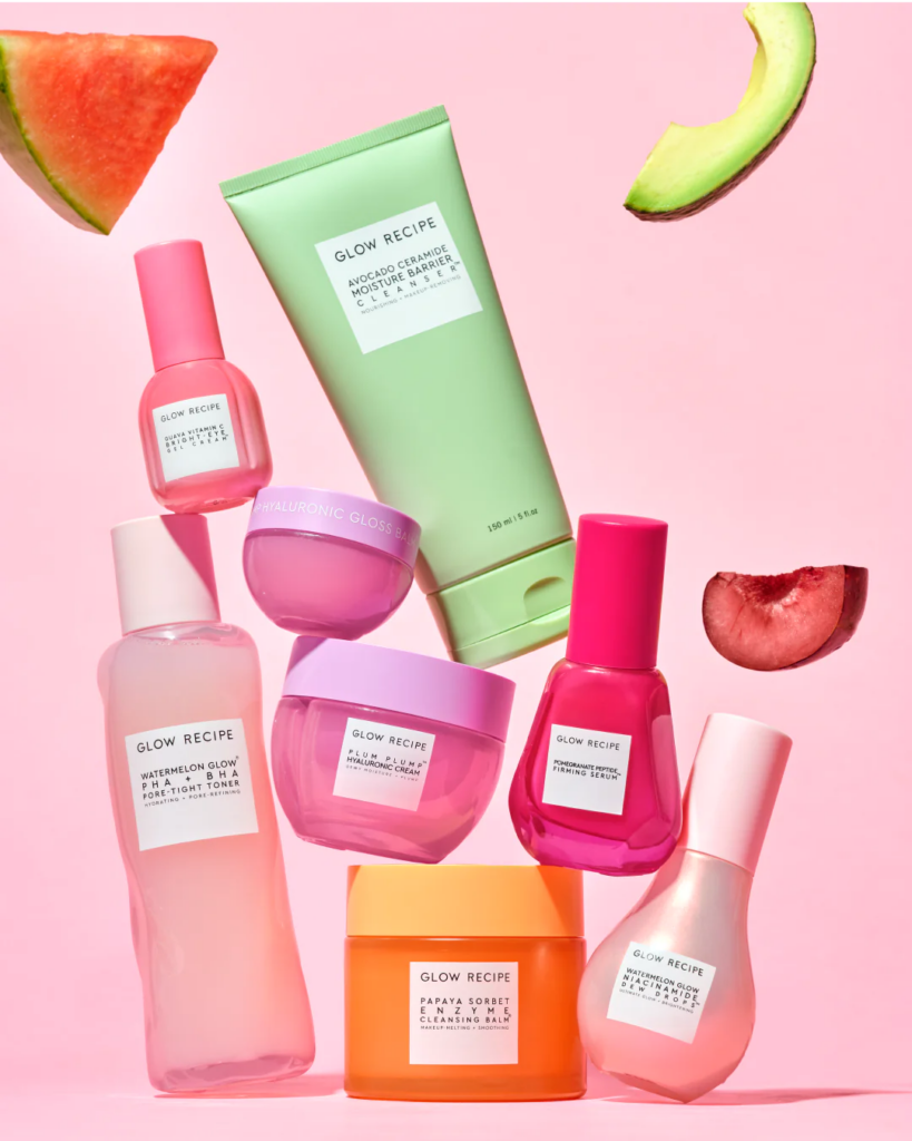
Glow Recipe: Mastering the Art of Fruit-Powered Skincare
Glow Recipe has carved out a unique niche in the beauty industry with its visually appealing and innovative approach to skincare. The brand’s identity is built around the concept of natural, fruit-powered skincare, which is evident in its packaging, product names, and marketing strategies. With its use of vibrant colors, clear and playful packaging, and fruit-themed product lines, Glow Recipe communicates a sense of fun, freshness, and effectiveness.
The visual identity of Glow Recipe is not just about looking good; it’s deeply integrated with the brand’s commitment to using fruit extracts and clean ingredients. Their products, such as the Watermelon Glow Sleeping Mask and the Blueberry Bounce Gentle Cleanser, not only sound delicious but also promise effective results with natural components. This combination of efficacy and sensory pleasure makes Glow Recipe stand out in a crowded market.
Moreover, Glow Recipe’s branding strategy cleverly uses social media to showcase the sensorial and visual aspects of their products, engaging with a community of beauty enthusiasts who value transparency, sustainability, and innovation. Their Instagram feed, for instance, is a testament to the brand’s vibrant aesthetic, featuring product shots, ingredient highlights, and user-generated content that showcases the real-life benefits of their skincare line.
Glow Recipe’s visual identity has successfully positioned the brand as not just a skincare line but a lifestyle choice for consumers who prioritize health, wellness, and joy in their beauty routines. By marrying effective, natural ingredients with an eye-catching and cohesive brand aesthetic, Glow Recipe has managed to create a memorable and desirable brand experience that resonates with a wide audience.
In the comments below, share your thoughts on these brands’ visual identities. Which one resonates with you the most, and why?


comments +